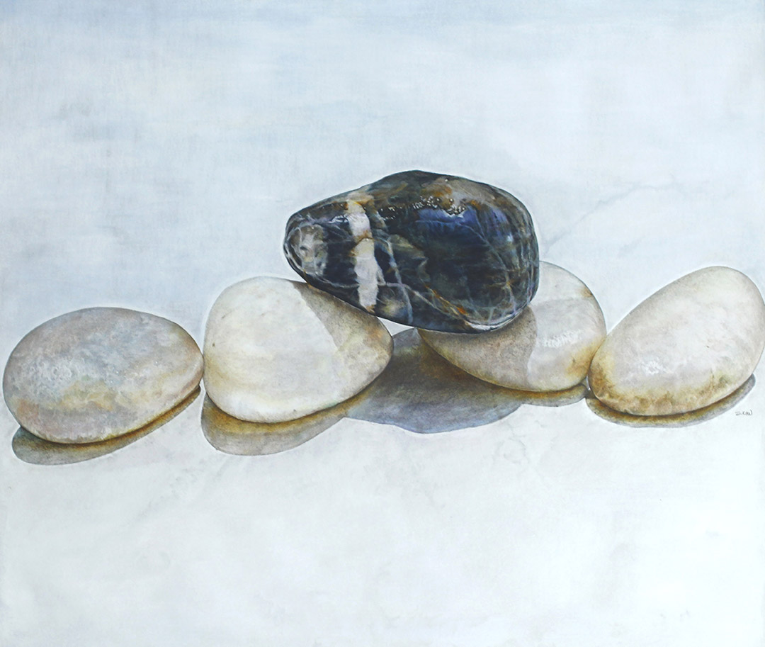
Equanimity – calm, composure, presence of mind, serenity, tranquility.
As shown in several of my work, rock/pebbles seems to be one of my favourite subject. I find them very versatile, both in paintings and expressing human feelings metaphorically. They can be intense yet subtle at the same time.
With this piece, I wish to portray a sense of tranquility yet complex at the same time. At a glance, the whole composition looks calm and serene. But take a closer look, you will see so many muted colours and textures in every individual rocks. Just like us human beings, we are unique in our own way.
If we as a society are able to practise tolerance, understanding and respect for each other, no matter how different we look or difference in belief and creed, we CAN co-exist peacefully. Imagine a world where everyone look and think alike, scary isn’t it?

The size of this piece is 36 x 36 inches (91 x 91cm) on a 300gsm hot pressed Arches Aquarelle water colour paper using Faber-Castell Albrecht Durer and Polychromos colour pencils. Reference is my own.
Albrecht Durer is a water soluble colour pencil that can be either use dry or wet. There are two ways of applications. One is to use it dry on paper and go over it with a wet brush or shave the lead and premix it with water and then apply on paper like the traditional watercolour technique.
I used the latter method, only for the background. I use it as a primer, to fill in the tooth of the paper before applying the Polychromos. That way, I get a smoother and even application without the white of the paper showing through.
At a glance, this piece may look simpler compared to the earlier pieces but I can tell you, it was not, in fact it was the toughest piece amongst the three.
Technically, it is rather difficult to get ‘even’ application with colour pencils for light colours. Dark colours are much easier because all I have to do is use all the strength I have to get that deep even tone and any slight difference will not be too obvious.

I enjoyed doing the dark coloured rock because of the distinctive colours and textures, it was joy and a breeze to work on BUT not the lighter coloured rocks.
With these light colours, I have to be mindful with the pressure of application and careful studies of colours. I think there was about 7-8 colours in that one rock and most of them were not complimentary colours. To make it translucent, colourful yet muted was a real test of patience.

Overall, I am glad that I pushed myself to work on this and as I went along, I have learned a lot, technique wise. And I realised that the main tool for any coloured pencil art is PATIENCE.

Equanimity is one of the three pieces that was exhibited in the Langkawi Art Biennale 2016. That event opened many doors to this medium, it was a good exposure. Many mistaken it as acrylics or oil paintings until I mentioned that it was just humble colour pencils, the look on their faces were priceless, “colour pencil?”, “Yes.” “……. COLOUR PENCIL!”, “Yes.”…… I had to repeat myself several times, LOL.

Shortly after the Biennale, I received an invitation to Taiwan for the 2017 Taiwan International Art Exchange Exhibition “Yunlin Art Together” in April next year. It was through the Biennale that I get this opportunity.

To my knowledge, there are a total of 40 local and international invited artists and 3 from Malaysia, including myself. It is the first time for them to include coloured pencil art in the event and I am very very lucky to be invited and guess what? It will be my first time to Taiwan. Coloured pencil art is taking me places!!