Every once in a while, I have to explore something that is outside of my comfort zone. Like this one, for instance.
I came across the artworks by the late painter, Walter Tandy Murch . Was absolutely captivated by his style. Very texturised, clever play of light and shadows with multiple muted undertones of colours. It is something in-between expressionism and realism genre of artwork. Most of his still life subjects are your everyday things but very old; antiques. A subject matter which I love.
That got me thinking perhaps, I could try to implement some of his style with colour pencils. I know very well that it could never be 100% like his but maybe ‘adopt’ something similar. With that in mind, I have to find a subject that I can try it with.
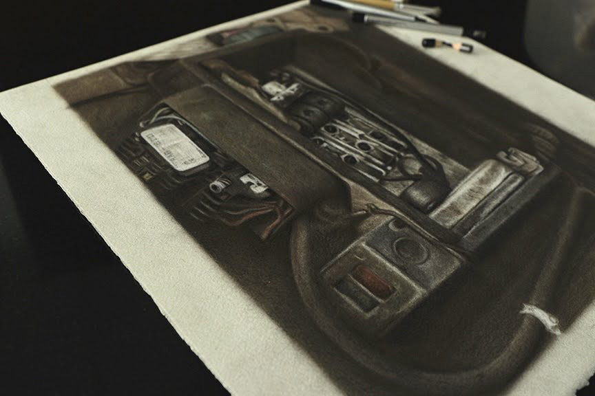
While trying to look for the ‘candidate’, I recalled that I took a photo of an old electric meter way back in 2018 while I was in Taiwan. I did a painting from the same scene a while back https://sharonsskow.com/2018/05/24/and-thereby-hangs-a-tale/

At that time, I felt that it was nothing extraordinary but somehow, something about it enticed me to take a photo of it anyway. The subject itself looked pretty messy with so many stuffs/junks around it. Wanted to paint it many times but just did not ‘feel’ it yet. Until now.
I had to practically scroll through tonnes of photos before I found it. And when I did, boy, it made my day.
The colours and tones of the subject in the reference photo was quite saturated, which is not what I intended to do. I envisioned the piece that I am going to create will be much more muted in tones with just hints of colours showing through. How do I do that? To tell the truth, I don’t quite know and didn’t want to think so far ahead. Let’s just do it first and let my intuition takes over.
In my opinion, to get that very texturised effect, using the cold pressed paper might just help with the process. Coincidentally, I had a smaller piece of the cold pressed Arches watercolour paper which was kept away for a long time.
I decided to use only the Faber-Castell Polychromos because I knew that it will give me the sombre moody tones that I want. To get a smooth blending of the colours on the rough surface, the stencil brush will do the trick. For highlights or lightening of tones, instead of using white, which will be too harsh, I use various shapes of erasers; both the Tombo Mono zero round and rectangle erasers plus the regular soft erasers. That was all I need for this.
With all that in hand, I began my journey to the unexplored…

The initial line drawing was quite easy, this I knew because it was not going to be a detailed piece. Just drawing out the outline as a guide for scale and proportions of the subject.
Even while working with the colours, it was not that challenging yet. I applied the various colours and tones evenly and blend it all with the stencil brush. It was actually quite fun and kind of liberating without the need to work on every little detail.


As shown here, the whites of the paper textures were very noticeable. But once I blend all that with the brush, only the textures of the paper can be seen. And that is what I want it to look like.
The final step is to create the highlights without being too harsh. It needs that blurry glow on the lightest areas and soft shadow lines that separate the light and dark areas.


Unlike the wet medium, with colour pencils, it is not possible to add on highlights on saturated areas. It will either get murky or totally lost.
To create that subtle highlights, I use the erasers to lift off some pigments on the intended areas. This in turn also gives a textured look of the surface.

Well, I could go on and on trying to explain how I did it but really, I am just not good at teaching, at all. What I did with this piece was all about experimenting. A trial and error thing.
I have always admire paintings by the Old Masters. If I ever take up oil painting, it is most probably keeping to this style of artwork. But I am pleased that I am able to achieve the feel of it with colour pencil. Not perfect but not too shabby.
Will I try this method again in the future? Yeah, I think I would and I hope I will do better.
