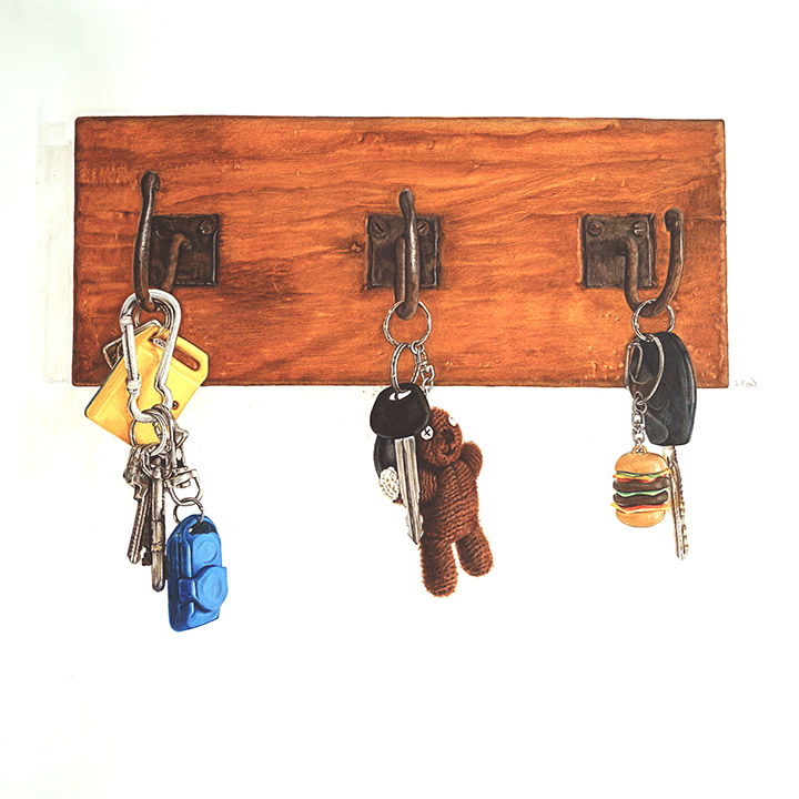
Now, this is a very interesting subject. The subject itself is very symbolic. Family.
The keys represent the individual in a family. Different types of keychains, various knick knacks attached to it. From there itself, one can roughly guess which key set belongs to whom, the father, mother, older/younger siblings.
This is a wooden key holder hanging in my dining area. In this painting, all the hooks were occupied, showing that everyone is home. It can be where everyone is home at the end of the day, a weekend or a holiday.
It is a very simple subject, very straight forward but you will feel a sense of warmth, love in a family.
Technically, this is quite an easy subject to work on. The focus here is to bring out the warmness of the whole subject matter. The painting needs to portray the warm fuzzy feeling of a loving home. The wood panel, with the earthy colour gave the sense of warmness to counter the coldness of the metal key rings and plasticky bright colour of the remote control.
The size of this is at 24 x 24 inches (60 x 60cm). Done on 300gsm Arches Aquarelle water colour paper using Faber-Castell Albrecht Durer, Polychromos and Caran D’ache Pablos and Luminance colour pencils.


To get the colour and the texture of the wood panel was a bit tedious. There was a lot of layering of colours going on in order to achieve that warmness of wood. And I was glad I’d used the Arches. It really withstand the abuse of layering and blending of colours.
There is a lot of negative space, the white area surrounding the subject, and that was done on purpose so that the eyes will go immediately to the wooden panel and then the hook. From the hook to the keys and the individual set of keys. And that is where you will notice the tiny detail of the object.


I love the yellow and blue of this set, It really pops out from the metal keys, loud yet subtle.

Working on this mini Mr. Beans’s bear was fun with all the tiny details of the fuzzy threads. To achieve that, I played with different pressure using the same few colour, a lift of colour here and there and voila, I managed to get that texture and depth quite easily.


I did not managed to get as many clear progress shots because this was done in end of 2015. It was supposed to be a part of the Biennale exhibition, the first piece, but after comparing to the other 3 larger pieces, this one seemed so tiny beside it so I kept it aside. This will be in my collection of work for my future solo exhibition.