Now, this is a very intimidating piece, something that I was not quite confident working on. The reason? This person happens to be my husband, who happens to be an architect AND architects are…. extremely fussy! There, I have said it.
Because of his passion, I was exposed to the world of architecture and became quite familiar with most architectural terms. I can be quite a good ‘critique’ when it comes to building designs (Ahem! Just saying..) To him, every little detail counts, nothing escape his scrutiny and at times, that can be a real pain (you know where) .
My first hand experience ‘working’ with him was when we were renovating our house a few years back. Oh boy, really drove me up the wall with his obsession with every little detail. But then, it was a good thing because it seemed to have rubbed off on me and it shows in my artwork.
I have always wanted to do a portrait of him, but what kind of portraiture? A portrait of him as some random person or as the husband of mine can be a tad too boring. What I want is to ‘capture’ the persona of an architect, assured but not arrogance.
That opportunity came by one day while I was playing with the camera app on my mobile phone, he came home from work and sat down beside me on the sofa and started telling about his day at work. As usual, I was half listening, half concentrating on something else and this time, the camera on my phone. While fiddling with the camera, I realised I could take portrait photos in the dark and immediately, I pointed the phone at him and snapped away while telling him to keep talking and ignore me. (That was how I got that look)

This time around, the title came first before I even started working on the portrait and I have to work around it instead. I spent quite a few days working on the composition, looking for ideas to tie with the title. Some ideas kicked in but I was not very confident about it as yet.

The techniques:
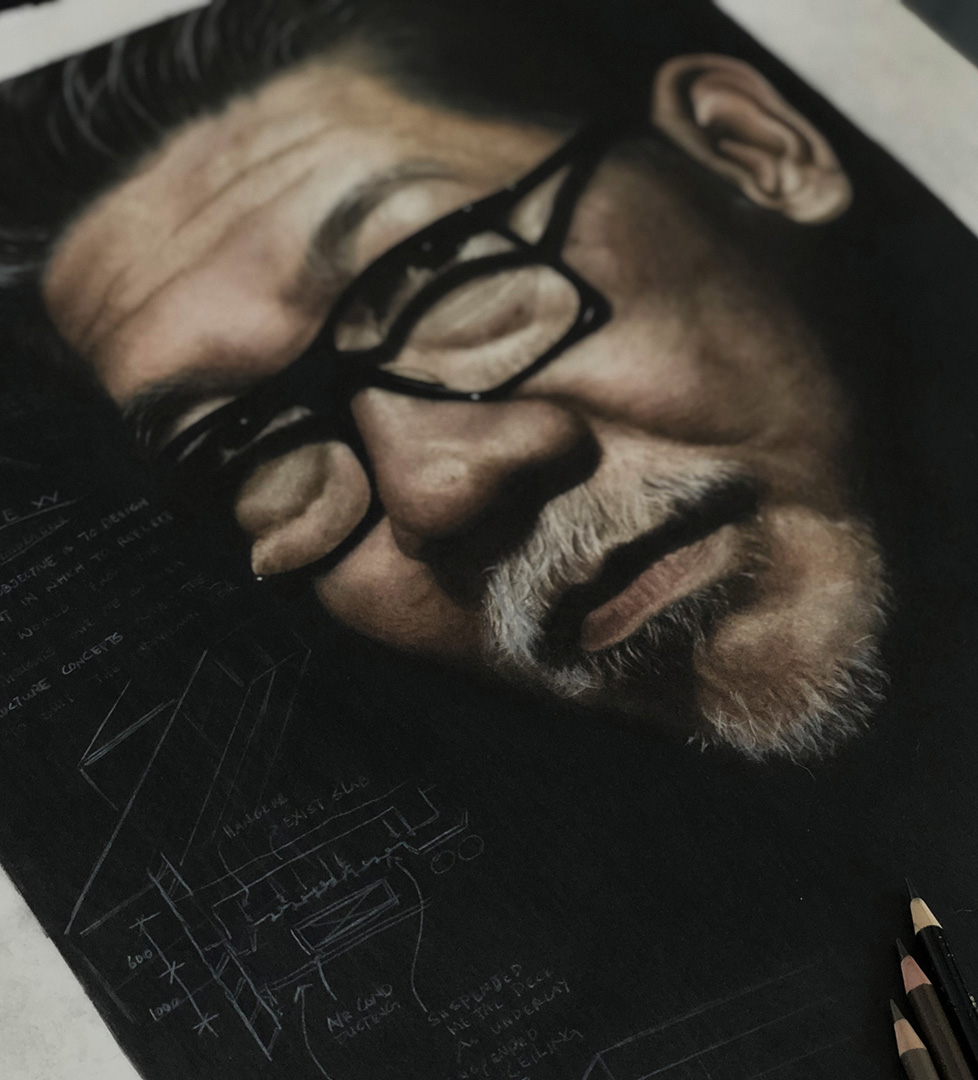
With this piece, there were not many work in progress photos as I wanted to have full concentration. I knew the background had to be the blackest of black and the best way, which I knew how, was to use the water soluble colour pencils – Faber-Castell Albrecht Durer. (I know there are other alternatives but I want to keep this 100% coloured pencils.)
I shaved the lead of the Black, Dark Indigo and Mauve and mix it all with a little water, using the flat broad watercolour brush, applied it directly unto the background areas. This also acts as a primer, to cover all the annoying white dots from showing through.
Once it was thoroughly dried (a day), I then use the albrecht durer Black, dry this time, and carefully apply the colour, stroke by stroke at the same pressure, over the entire background. But still the coverage was not good enough.
Because the nature of this medium, pencil strokes still can be seen no matter how meticulous the work is. To solve this annoying problem, I use a stencil brush, holding it upright or slightly at an angle, using the tip of the brush, gently blend everything together.
Since the pigment of the Albrecht Durer pencils are matt and quite powdery, it is easier to push the pigments into the tooth of the paper surface. Here is a short demo on how I use the stencil brush to blend the colour. https://www.youtube.com/watch?v=TmK5BralorQ

Working on the skin tones was quite challenging. I do not have a specific colour chart for this. Faber-Castell Polychromos is solely used on the main subject because the lead is hard enough for detailed works. It is always a tried and tested thing when it comes to skin tone because there are so many colours involved. Mainly the colours are Nougat, Medium and Light Flesh, Burn Sienna, Burnt Umber and a bit of Walnut Brown.
To get the highlights, I use the TomBow Mono Zero for finer areas and a soft black eraser on the larger areas to lift off the pigments. To get a sharper contrast, I use the White over it.

After all the details on the main subject was done, it was time to get working on the background. Now, that was the most challenging part. The background have to be subtle yet present, not fighting with the main subject. It needs to give an overall feeling of the ‘now’, contemporary, just like architecture, keeping up with the flow of time.
What shall I do or add that will tie in with both the title and the portrait? After much research and picking my brain (for days!!!!), I concluded that the best way is to implement something that will accentuate the essence of the portrait.

I recalled that he still keep a couple of his old sketchbooks, both from his Uni and early working days. I took my time going through all of them and selected several sketches for the portrait. Instead of trying to imitate his sketches on the painting, I traced it. I did that to preserved the authenticity. I am not architect and I doubt that I will do a good job trying to copy his handwriting.
It took me a few days after it was done to finally put my pencils down and sprayed on the fixatives. I felt that I can still do better but for now, I guess this will do.
