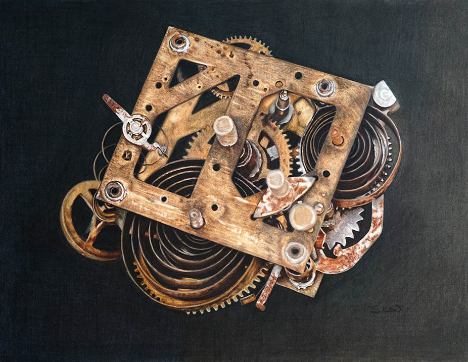
Time can be so unforgiving. Even the mechanism that we use to measure time gets antiquated as time goes on.
Just like us, with each passing day, we grow older and in a blink of an eye, years passed and when we look at our reflection in the mirror, we see our parents instead.
BUT is it a bad thing? Given the opportunity, would you want go back in time? To be young again?
To me, the ups and downs, good and bad that I had experienced throughout four decades, made me into who I am today. A much more confident, calmer and patient person. I observed and listen more. I have learned to appreciate each passing day.
All that, only time can give, no money in the world could buy that.

This is the second sequel to my ‘Time’ series. Why did I chose this subject matter? I believe time is very significant in everyone’s life. Our lives revolves around time, no matter how old we are. This subject is a metaphor of human life, something everyone can relate to.
Technically, I have always wanted to draw/paint mechanical parts, I love challenging myself with all the nitty gritty details of the mechanism. But I do not want to do it just for challenge sake, or a thing of beauty. I want it to interpret/relay my thoughts, I want it to ‘speak’ by itself.

I began by getting the outlines and curves using the bendable ruler. It is very technical, especially the cogwheel (gears). I did not worry much about the super accuracy of each gap or that every inch has to be perfect because I am doing a painting and not mechanical drawing. To make this work, I played with the value.

The background is important, I want it very dark but with nuance or depth. Not just plain black or else it will turn out flat. And therefore, before applying the black, there are quite a number of colours that went into it.

On the left (the darkest part) I used only Dark Indigo. Covering almost half of the area.
On the middle top and bottom part, I used Deep Cobalt Green, Chromium Green Opaque.
On the right (the lightest area), top through bottom, I used Earth Green, Dark Sepia, Walnut Brown and Warm Gray VI.
This took a lot of time because I have to make sure every tooth of the paper was covered with the base colours. I played around with the pressure to get the blotchiness. Used the blender pencil to get even coverage before I applied the Black. I kept going over it with Black until I get a good dark coverage.

On the lighter part, I lightened the pressure of the Black to get lighter tones. Blend further using the Warm Gray VI. That gives the blotchiness and with that, the depth starts to show.
By doing the background as such, you will get a 3 dimensional feel. It sort of gave ‘life’ to this rusty piece, it softened the starkness of the contrast between the background and the subject.
The most difficult/critical part of all my art process is the composition and set up, how I want to look like, what I want to convey and which part of the subject I want to emphasise and so on. Then when I put it on paper, it is all just technical.
