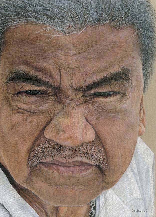
Now, this is an interesting piece. You may think, who on earth is this ‘weird’ looking man, what made me paint him?
Well well, this funny looking man is my DAD!! People who look at me, then him, will go “Are you sure?” We get that remarks, always!! Let me just tell you something about him.
He is half chinese(father’s side) and mom side is eurasian. There’s where the surname ‘Kow’ came from (Kow in mandarin means tall). His mom side is ‘Fidelis’, a mix of dutch and something else…(lost in generation) LOL….. And there’s where he got his tanned complexion.
Ok, let’s cut the story short.
He is very supportive of my art work and always tell me to paint a potrait of old wrinkly people. I was quite reluctant to because I don’t think I could handle wrinkle well. So one fine day, when he came to visit and my daughter asked him to do a ‘funny’ pose, and there you go…. I didn’t pay attention to the picture until a week later when I was browsing through my daughter’s camera and saw it. It was clear& sharp enough and looked really funny to me, but scary to others. So I figure, let’s do this.
For those who live or have lived in New York will find the title “Stand back 200ft.” very familiar. It’s was taken from the NYFD (New York Fire Department) tagline. My husband, Eric had lived in NYC for almost 10 years and he loves collecting uniforms or clothes from the army/police/fire department etc… He has this bright red t-shirt from NYFD with this message at the back. By putting it as the title of this potrait, it gave a sense of humour to a somewhat ‘fierce’ face.
Below are all the stages of drawing that I’ve compiled.
As usual, for potraits, I used the grid method. On the tracing paper, I draw a 1×1 inch grid with pencil and sticked it on the reference picture rather then draw on it, that’s because I don’t want to lose out any details of the reference.
I then used Daler Rowney 16×12 inch ‘sand’ coloured paper for the painting. I draw a 1.3×1.3 inch grind on to drawing paper itself, very very lightly with a 3B faber castell graphite pencil.
With all the grids done, I proceed with the sketch, 1st. doing the eyes. To me, the focus point of this painting is the eyes. Then the nose, lips and so forth. All this, I do with light feathery sketch, I don’t want any dents or graphite to be imbedded in the paper grooves as I’m using Daler Rowney slight textured paper(which I so love).
So I started the coloured pencil on the pupils of the eyes, as you can see, it already came to life the minute it was coloured. Then the rest, just follow through. The biggest headache of all this process is the getting the correct skin colour. Fair skinned Asian have yellow undertone, while tanned Asian have a slight orangy-yellow tint undertone. (I’ve learned these during my ‘professional’ make up artist course which I took quite some time ago, before I started painting on paper. Yeap, used to paint on people)


So, it was a lot of experimenting with cinnamon, pink, yellow and orange, cream, white, maroon etc… all in all, I think I’ve used almost 20 types of colours for the skin tone, phew…. Of course, there’s lots of blendings, burnishings, very heavy duty ‘pressing’ in the process. Thank goodness for polychromos, they don’t give that irritating wax bloom like all the wax based coloured pencils. If not, I think I would have destroyed God knows how many papers.
After I’ve got the skin tone right, I proceed to colour up the surface, then add in the highlights and shadows. Then came the most tedious detailings, the wrinkles. I had some difficulties on the left forehead where the wrinkles are most obvious, to get the right shadows and highlights was a lot of hit and missed. The facial hair and hair was actually quite easy to work on, only that I need to keep the tip of the pencil very sharp and the strokes must be precise or else I’ll get that undefined lines that will fade out when I add in the whites. For the white, I’d used Derwent drawing ‘chinese white’, my favourite, because it’s really white, no matter how many layers of based I’ve applied on the painting. I always keep stocks of it, lucky that the art shop over here stocks up the loose ones.
I’ve never like to use maker/gel pen for highlight, I know that quite a few people used it, I’ve no problem with that but I like to stick to the same medium for my work. Maybe in the future, who knows.


So, there goes my story for now. I think I quite like doing potrait, with a twist. It’s challenging but rewarding! Oh yeah, I’d posted the progress on CPAL on FB, as usual, the fellow artists were all so encouraging, they are a kind and nice bunch of people, never criticised or commented unless I asked for it. This one Dianne Peters Gruber suggested that I join CPSA (Colored Pencil Society of America) and enter this piece to their new online competition (ArtSpectacular). I was not confident enough to enter but after much encouragements from her, I did! But 1st, I must be a member to join, it cost me USD$65 (around RM200+) but I think it’s worth it since in Malaysia, no one appreciate coloured pencil art (I’ll write about it some other time). Whether I’m choosen or not, it doesn’t matter as I think what I need now most is the exposures. My aim is to enter as many competition as I can and the highest aim is to get the CPSA signature. Too high of an aim? perhaps, but, never try never know……