What can I say, I did a commissioned work!! Which I never intended to do any at the first place. WHY??
First of all, I find it tedious to do commissioned work as it’s very difficult to please everyone. I may like something which someone may not. One man’s meat another man’s poison.
I was approached by Wendy, the owner of Leo books located in Island Plaza where I rent all my books. She is the one that really got me started on my art work. She inspired me to paint a picture, which I posted ealier, ‘Water for Life’ for water.org. And also, she also suggested that I put some of my work at her shop for sale, what a nice lady, so how could I not do a favour back?
 I got her email one fine day sending me this reference photo of Leo, the ‘legal’ owner of the shop actually, and she asked me whether I could do a commissioned as a birthday gift to her god-mom, Dolly, who is the partner of the business. Well… I was really reluctant, was afraid I’m not good enough. So I told her to email me more photos of Leo from different angle, and she did, 8 of them!!!!
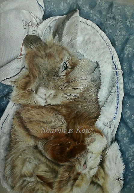
Feeling her enthusiasm, I felt bad and decided to give it a go, I told myself if it doesn’t come out right, forget about it. So I decided on the 1st picture that she sent me. As you can see it’s pretty difficult to paint because of all the furs. I have to do some photoshop on the picture to deepened and lightened so that I could have a defined detailings and also get a good the lighting composition. I printed out the reference picture at a A4 size.
Firstly, I chose a 16×12 inches, 98lbs (406x305mm, 160g/m2) grey pastel paper from Daler Rowney. Grey, because I want the whole subject to have the subtle cool grey underside, too warm or too bright will make it too cartoony, like Peter Rabbit,, so don’t want that!
Next, do the grid, which I’ve learned during my school days. I draw a 1×1 inch grid on tracing paper, then put it onto the reference photo. I then draw 1.5×1.5 inch grid on the grey paper using a ‘H’ Faber Castell graphite pencil. Once I got all the grid, I then started to sketch the whole outline of Leo.


Once I’ve done with rough sketches, I proceed with colour pencils. This time I decided to use Derwent Coloursoft series to get the soft fluffy effects, Derwent ‘Drawing’ series which have that earthy tones and also Derwent Artists series to get definition lines as they have harder leads. I started with the eye, as that is the focus point of the subject than proceed to do the fur using light feathery strokes, imitating the fur growths, taking care with the direction details or else it’l be one messy fur coat.

As you can see in the progress, how the furs turned out. It’s difficult for me to write down all the colours involved as I’ve used so many to get the right combinations. After all the shading of earth toned, I used white for highlight and very dark brown for definitions, never black as it’ll give a very harsh, rigid feel to it.


After I’m done with the main subject, comes the background. I like the ‘Good Morning’ towel, because it’s white with the blue trimming and a little red writings and don’t forget the textures. It’s not just plain flat white, as you can see. I challenged myself to do the thread linings, it turned out to be quite easy and very very interesting. To get the right blue was a task, I have to mix a few kinds of blue and grey to get it almost right. Once I’m done with the towel, time for the background. I can actually leave it be, just Leo and the towel. But I wanted something more…….Then I found out….. Leo is a female rabbit!!! Then it hits me!
I must do some ‘soft’ background, scratching my head for almost 2 days…pink? red? No, no, no, must be something cool yet soft. Baby blue, that’s right, turned around from my work desk, there it is, my doggy pillow!! Perfect texture, perfect colour. So, you can see that’ why the pillow is on the ledge.

Doing materials is not as tough as it seems to be, I actually has fun doing it. But the blue it’s a bit of a headache. So for the towel and ‘cushion’ background, I used Faber Castell polychromos because it’s the only full set colours I have, 120 pencils and they have all the greys and blues. To get that ‘cool’ blue, I first use sky blue all over then burnished all with cool and warm grey, that’s how I came to that sweet blue.
The whole thing turned out to be pretty satisfactory, I’m happy with the outcome, I don’t think I can do more to it as it is now. Wendy is very happy with the outcome and all this is under wrapped until Dolly’s birthday next month. Can’t wait to see her reaction, fingers crossed!!!
