I have not been writing my blog as much as I should this year. I have so far only written 2 and that is baaad…
But the truth is that I have actually produced 20 pieces of new artworks this year. Pretty productive, I may say. They were 7 pieces done this year for my solo exhibition, a continuation from 2019. 1 graphite portrait and 1 small demo piece for a fun coloured pencil art short video. 1 huge family portrait commission and lastly, 10 small cats commissioned pieces,
Even though the world sort of stood still because of Covid-19, I was very occupied with work. The commissioned pieces helped a lot financially. Sold some artworks during the lockdown. All that income came in handy to pay for the framing work of my exhibition pieces, which cost a bomb! A bit heartless to say this, but 2020 has been kind to me.
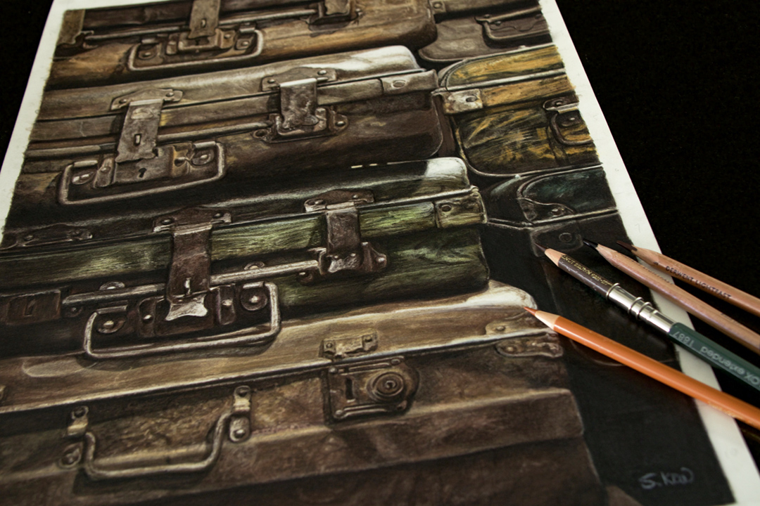
SO, enough of that. Let’s get ‘talking’ about this, the stack of antique luggages. Why this? And what does it stands for?
I happened to come across these stacks of antiques suitcases while on trip early last year. It was a small boutique hotel where the reception area was filled with these old luggages.
That, immediately garnered my attention. Just no reason why. Perhaps it is rare to see so many of those old suitcases all at one place. To tell the truth, it was pretty eerie with the warm yellow light and all. But then again, I just took the photos just because I like old stuffs.

After I completed all 10 commissioned pieces, which took me ages, I was all prepared to work on my new project for next year. But something was playing on my mind instead. I felt that I have to at least create a piece of art that best describe the year 2020.
I recalled having taken some photos of some old luggages and started going through my photos on my mobile. Almost lost it when I discovered that I have deleted the photos. But luckily, there is a backup file. I was so elated when I found it and I know it will make a perfect statement for 2020.

Let’s begin with a short description of the process:


As all my artwork, I will transfer the image unto the drawing surface using the basic grid method. That way, I am able to enlarge the subject easily without the need to print the reference photo on a large format.
I do not draw out every little details, just the main and important outline to make sure that I get the proportion right. Since this is Realism, it has to look recognisable.
I will then proceed to use the lightest colour of the same tone to define and map out the subjects.


Normally, my preferred brand of colour pencil is the Faber-Castell Polychromos. The lead of the Polychromos pencil is harder compared to other brands, which is superb for very detailed pieces. But with this particular subject, it needed to have that ‘painterly’ look. So it was a bit challenging for me to use them.
I ended up using the Derwent Lightfast colour pencils instead. They are softer and creamier. And because of their rich pigments content, I was able to cover the large surface in a much shorter time.
And that is it on the technical part. All in all, this piece is a breeze to work on. I took my time with it, no pressure whatsoever. Not much details to work on, it was more towards ‘playing’ of the value (light and shadow) to set the mood right.

Throughout this year, many artists have come up with artworks that depict the severity of this horrible pandemic that are affecting so many, irregardless of race and creed.
But I wanted to do something slightly different. Something that still shows the effect it has on our daily lives but in a wider perspective. With this particular subject, it reaches beyond just the pandemic. It is a metaphor of loss, abandonment.
Life still goes on for many as I write this. We are learning to live with this pandemic, hoping that soon, it will pose less life-threatening as time goes by.
Many of us will eventually pack up our suitcases and travel again but to some, it will just be a distant memory…..

