The last portrait I did was way back in 2013 and it was of my late father. He suggested that I should draw an elderly person with lots of character in the face. Which translated to lots of wrinkles and lines.
At that time, I was quite a freshie in art and I recalled telling him where am I to find one. Even if I found one, I will be too shy to take a photo of that person. In the end, he did me a favour and posed for me, scrunching up his face to produce as much wrinkles as possible (that’s how funny he was). A couple of moths after I have completed his portrait, he left us. It was the most devastating time of my life and I have not done anymore portraits until now.
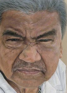
Stand Back 200ft (2013)
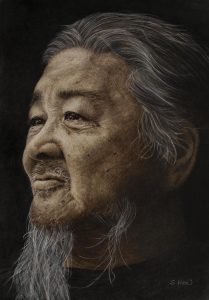
So now, what made me paint this particular portrait? I sort of ‘found’ this man during my trip to Taiwan recently. The minute I saw him, with that ponytail, I knew I found the perfect model.
He was sitting by a busy road at his little comfortable corner, people watching. Coincidently, he was an acquaintance of my Taiwanese friend.
This person was not that old but he has a sense of calmness. A person who is very contented with life paired with a happy go lucky attitude. I was very drawn to his eyes especially. So wise and deep with emotion. Very similar to my father.
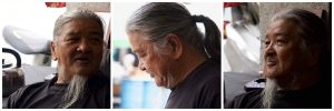
While everyone in my group was chatting up with him, I stood at a corner, silently observing him. I wanted to take photos of him but was too timid for I myself do not like to be photographed. But after quite a while, I decided to just go for it. I got my friend to asked his permission for photographs and tell him of my intention to draw his portrait. He was very obliging and did not mind me taking loads of candid pictures.
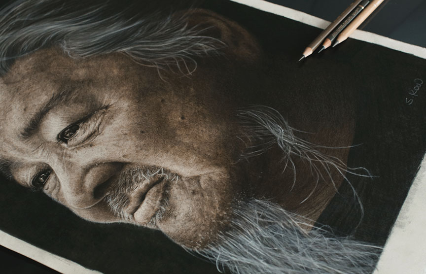
When I came home, I was very eager to start on the portraiture. I went through all the pictures of him and narrowed down to a few and finally decided on this:
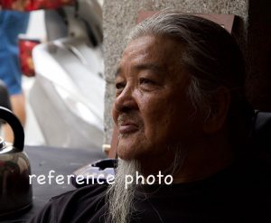
It was the perfect look and composition. But instead of doing it in colour, I decided to do in monochrome. I want to capture THAT look of contentment.
The Process/Techniques:
Materials: 300gsm hot pressed Arches aquarelle paper. Faber-Castell Polychromos/Albrech Durer (background). Caran D’ache Pablos/Luminance.
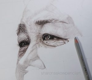
Initially, during the beginning of the drawing, it was quite a breeze. I was happy with the outcome of the features, especially the eyes. But then, as I progressed on to the skin tones, I was struggling.
The process of creating the different tones and details of the skin textures using limited colour palettes was not as easy as I thought. There was a lot of adding and lifting off the pigments. Thank goodness for the Arches paper. It really withstand a good bashing.
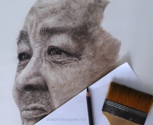
Next, the background. Something that I am not good with. I have always struggle with the backgrounds. But for this portrait, leaving it bare or even copying exactly like the photo is totally out of the question.
Why? Firstly, leaving it bare (like the picture shown) just do not hack it. Something is missing about the whole look. Secondly, to put in all the ‘noises’ as in the reference photo, will totally wrecked the overall mood.
After much thoughts and researches, I decided to go for a plain dark background . Using the Faber-Castell Albrecht Durer water soluble pencils, I shaved the pencil leads of various colours, mix it with a little bit of water and brush in on directly to the surface.
The background was done in way that it is not perfectly smooth and evenly toned, it is slightly patchy with a play of light and dark areas. That gives the portrait a slight rugged look. Once I have covered the entire surface, I left it to dry for 24 hours. This was just a first layer, acting as primer for the dry pencils on top of it later.
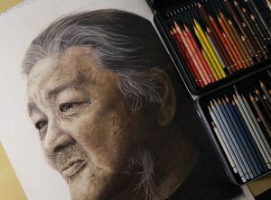
After it was thoroughly dried. I applied the Faber-Castell Polychromos, using colours like green, green gold, dark maroon, dark blue. And on top of that, just black on the entire surface very neatly. This process will give the background some depth instead of just plain black which can be very flat.
Once I got the background done, I went on to adjust the tones on the subject and that was when the struggle hits me. Why?
Now, working with colours, I am able to softened or strengthened the nuance of tones. I can add some creame/white/beige to softened or add darker tones like dark brown, dark maroon to deepened the edges or lines.
But with limited palettes like this one, I have to either darkened with the darkest tone or lift off the pigments instead. By doing so, the edges and lines get very harsh. Blending with the blender pencil helps but still the harshness of the tone difference is very much visible. I cannot tell you how frustrated I was at the end but I have to stop meddling with it and move on.
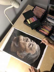
When I posted the final result on on Facebook art page, many gave me encouraging feedbacks. They did not see flaws as I see it. Instead, they see the whole expression of the portrait. It took me a while to see what they see and realised that I in fact, have achieved what I wanted. I have to stop looking at it technically and ‘feel’ the portrait instead. I have became my own worst enemy in the process and I can tell you, it is not a good feeling at all.
I have to thank all my lovely supporters and friends who are there to pull me out of the sink hole. Who gave me the encouragements when I needed it most. I have definitely remembered something very valuable with this portrait, that ART is not about technicality, it is all about the EMOTIONS.
And how could I forget that!