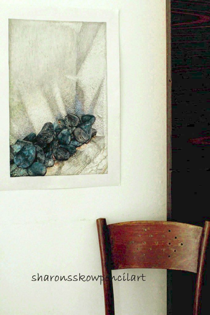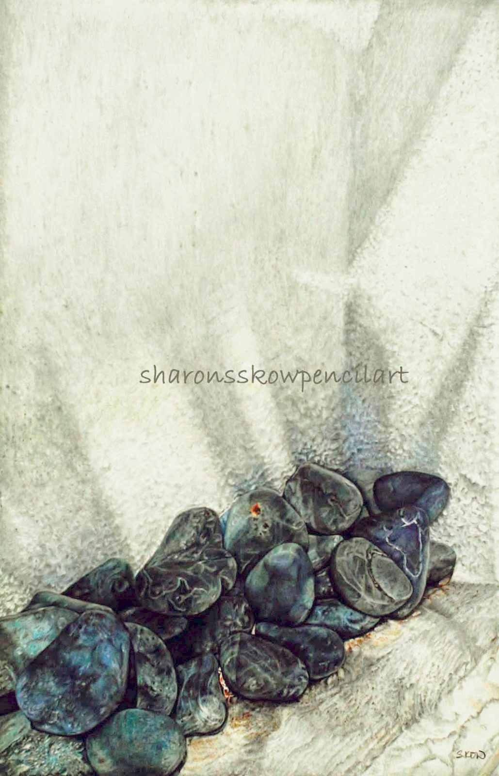
‘Resonance’ 23″ x 15″, 140lbs Bristol Vellum. Faber Castell polychromos.
Every Morning, after husband and daughter leave the house to work and college, I will have my coffee at the dining area, looking out to the garden and savouring the quiet time by myself before I start my day. That particular morning, the sun was unusually bright and everything looked so refreshing.
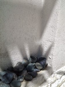 I have rows of river pebbles lined up the edges of the house perimeters, they are usually quite dull but on that particular day, those pebbles somehow looked so beautiful resonating under the bright rays of the morning sun. The shadows cast from the frangipani tree added to the serenity to the whole scene, I knew that I have to paint this. I have painted rocks/pebbles before and I find them calming to paint because there is no set rules on how a rock surface have to look like. All depends on how I want to portray them.
Before I start working on any reference photo, I will use photoshop to re-adjust the whole picture. A reference photo, to me, is used only as a guideline. I will set the mood of the painting by playing with the lights, shadows and colours, emphasizing the subject matter. That is why I don’t post the reference photo with any of my work in progress on my art page.
For this painting, I used Bristol Vellum, a paper given to me by Barbara which she hand carried back from Canada. We could not get this paper here but since we heard so much about it on a group we are in, she decided to buy a whole roll of it to try on. This paper is 140lbs (300gm) in weight, size at 23 x 15 inches. It is very white and smooth in textures.
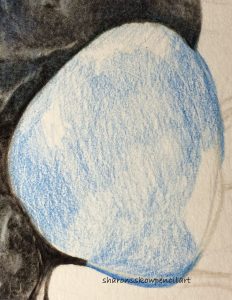
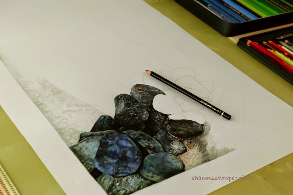
Sketching this whole picture was easy, I just need to make sure that all the main subject is in place, the shadow lines etc. This I did without using the grid lines.
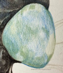
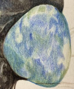
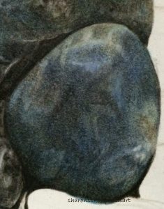
Here are the progress work done on one of the rock, as shown below, it was just playing with various pressure to get the textures going. I am using the oil based colour pencil, polychromos by Faber Castell which gave a slight sheen to the rocks.
It was a breeze working on the rocks until the concrete wall part. It was not as easy as I thought it would be. I ended up using the pointillism technique to attained the textured surfaces. It took a toll on my wrist and fingers.
In the end, it was worth all the pain because it turned out not too bad but I think I could have done better, a very good learning process for me. Every piece of my work, I learned or discovered something new. That is why my subjects tend to varies for I try to learn as much as I can.
To me, the perception of light and shadow is the most important skill in any art work. Like everything in life, there have to be a balance, the yin and yang, negative and positive. With that perception in mind, simple things can be the most beautiful subject. So, my aim for this year, is to paint simple, everyday subject emphasizing on strong contrasting value.
With that in mind, I have captured several good references, all within my own surrounding, simple everyday objects and subjects that we never paid much attention to.
Stay tuned…