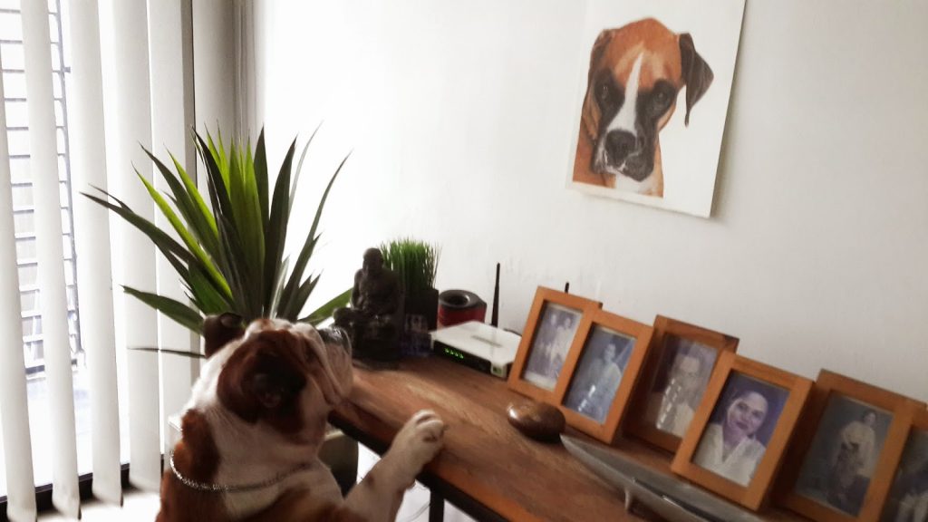
Caught Spike in action! He was barking and tried to attacked the portrait of Justice. Sorry for the shaky photo, I was trying to captured this and in the meantime tried to prevent him from overturning the console table.
I was approached by this sweet talented lady, who is a writer/author/publisher during the opening of her book launch sometime back in early October 2014. She asked me whether I do commission work. It caught me by surprise because she is someone well known in the literary circle here in Penang and I went “Hmm….” and my friend, Esther, nudged me and said “Hey, you know, work that pays..” Of course I know that!! I was a bit reluctant to accept because I was in the midst of preparing for my exhibition and really could not take any more stuff at that moment. I explained my current situation to her and said that we could talk further about it after I am done with my exhibition, IF she is still interested.
And she did get back to me, after the exhibition….. And it was 3 more weeks to Christmas.
This portrait was to be a Christmas present to her very close childhood friend and she could not think of any other better gift than a portrait of her friend’s beloved pet dog, Justice.
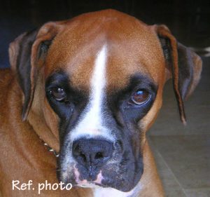
Now, I am very lucky to received such clear and sharp photo image of Justice, it made my work so much easier. I asked a little about the owner’s background, personality, character etc.. I was not trying to be a busy-body but it was for me to get into the ‘feel’ of relating the subject and the receiver. And I was told that her owner’s favourite colour is purple.
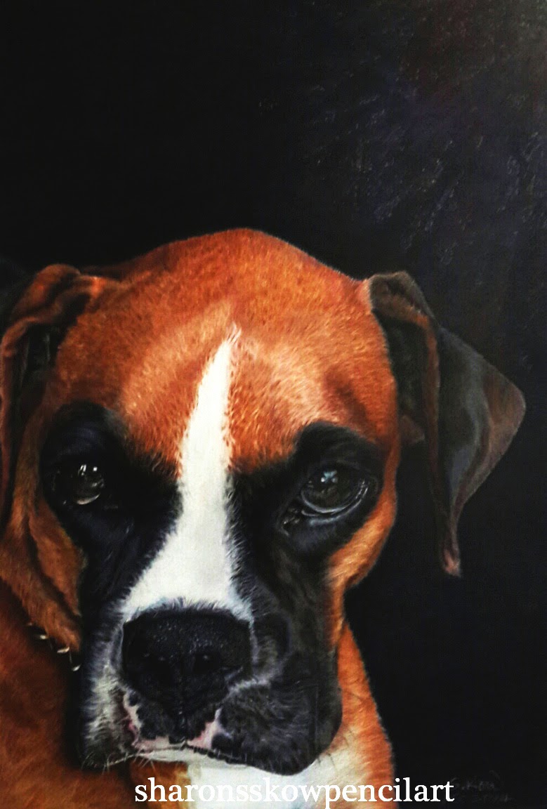
Justice, a female boxer was a very much loved and pampered by her owner and her family. They were devastated when she crossed over the Rainbow Bridge.
As a dog lover, I knew exactly how it feels to lose any one them. So I told my client I will take a week to do this up but I ended taking only 4 days. It was a record breaking time to me.
This portrait was done on A3, 300gm hot pressed, Lanaquarelle watercolour paper. Faber Castell polychromos and a bit of Lyra Rembrandt polycolor colour pencil. Both oil based pencils. Last but not least, Derwent battery operated eraser.
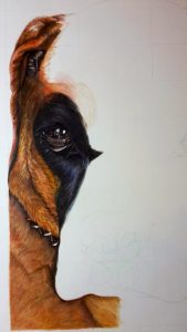
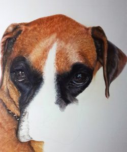
This pose from the photo is a very common pose for pets. So, before I begin, I asked myself, what do I want to focus and emphasised on to make it stand out. Details? Not really. In fact, I can’t do much to change the whole outlook. The only thing I can do is to really focus on the eyes, emphasise it, make it as though she is ‘talking’ to you, it has to look alive.
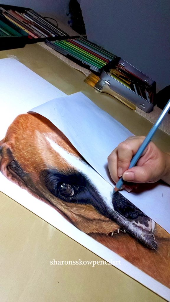
Once I get the ‘point’, I begin by drawing the grind box, for accuracy. I use the measurement of 1.0inch to 1.25inch to enlarge the subject from an A4 to A3 size.
Now comes the composition of the whole portrait. Instead of putting the subject smack right in the middle of the portrait, like the reference photo, I pull the subject slightly to the lower left, leaving space on the upper and lower right. I foresee that when it is framed, she will look as thought she is peeping from a window, looking out for her family.
Once I am very sure of the composition, I started to do a light sketch outline, paying attention to the main features. Boxers have shorter hair compared to Bulldogs, and it doesn’t mean is easier to do. Looking at her shiny coat, I knew that she was very well cared of. So the shine of her coat MUST be shown.
 I begin by applying brown ochre as base coat, using light sweeping stroke according to the hair growth direction. Still using the same colour, go through the same process by varying the pressure of the pencil. Using the same process with raw umber and bistre. Now with all these yellow based colours, the coat looks dull. To get the shine, I apply burnt sienne and a bit of terracotta. I choose van-dyck brown and walnut brown, on a sharp tip, randomly apply lightly at the area where the shadows shows. Again, using more pressure on the darker area.
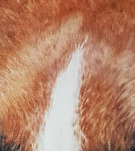
Always remember to use the stroke method, does not matter whether it is down to up or vice verse. Because of the short coat, the pencil strokes need to be short too and it can be quite tedious. The initial base is easy, because it can be applied without the need to care about the hair growth directions. But when it comes to creating the illusion of depth, like the forehead, gradation of value is use to bring out the textures. the control of the pencil pressure is paramount. You can use the same medium colour , using 3 kinds of pressures, light, medium, heavy in a very close zig zag method, something like you see in the motion/movement measurement chart (i.e. Lie-detector test??) For definitions, I use van-dyck
brown, applying the colour beneath the darker values to bring out the textures.
For the tiny highlight, the battery operated eraser works wonderfully. The only thing to be careful of is the amount of pressure you apply. It needs to be held in a steady and firm grip and lightly touch the surface of the paper. Touch and lift in swift motions.
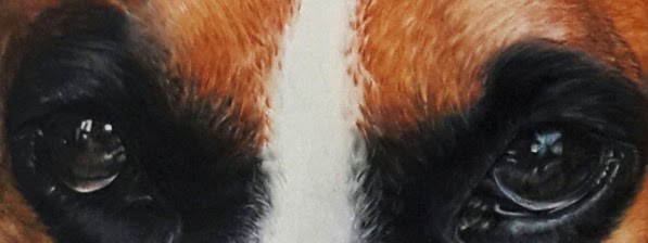
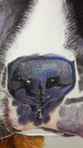
The eyes need to consists of many colours to make it look fluid. These colours, olive green yellowish, blue reddish, dark indigo need to be applied before going over the whole pupil with dark sepia and black leaving the white/highlight blank. To define further, use a very sharp tip of the black and carefully define all the lines, including the highlights. Apply a slight touch of sky blue on the white (very near the black line) to make it look fluid.
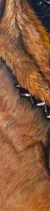
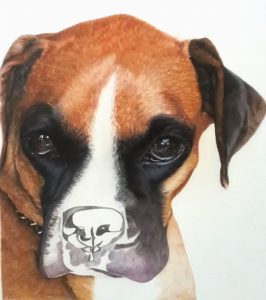
The nose are in fact the easiest and fun to do. I outline the nose bulb with black, darkened the shadowed part and proceed to lightly shade the whole are with the same colour.
To show the moistness, I use cobalt blue, ultramarine on the tip, magenta for a bit of warmth showing through at the bottom of the bulb. Light flesh and cinnamon on the sides of the philtrum (space between the nose and lip). Once I am done applying all these colours, I go over the nose bulb with the same black.
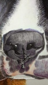
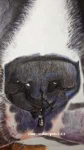
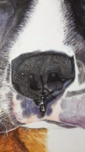
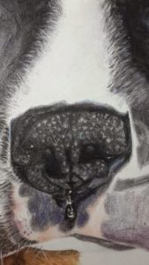
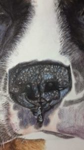
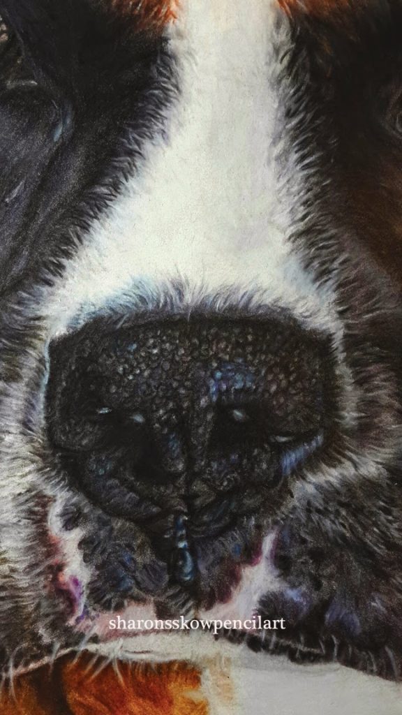
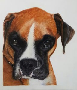
Now the fun part begin. I use the battery operated eraser to lift off the colours in dotted form. It was FUN!
After the I get the dotted forms, I proceed to use black to define it and I am done. It is that easy.
Framed photo of Justice sent by the client.
Now, all is done except the dreaded background. Background plays a role in a painting very much. I know I can leave it just like this, blank background But I want more, it looks too impersonal. I want intimacy, warmth, etc.
And so, I decided to do a very dark background with darkish purple and maroon colours, to add depth to the black. This will pull the attention of the whole painting to her soulful eyes.
I was glad that I decided on the dark background, it gave out a very different feel compared to plain white background.
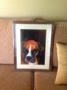
The responds I got from the client and her friend were so touching, it was all so worth it and I am very glad that I did this commissioned piece. The feedback, the gratitude that I received were the best payment ever.