There’s something about quietness. That particular moment where we are able to hear our innermost thoughts. A time for reflections, contemplations with a hint of melancholy.
No one can deny that in some point of our lives, there are times when we need to be in THAT quiet moment. It is not about self pity or sadness, just ‘down’ time, to halt and reflect.
To retreat into the quietness is not selfish, it is a dissonance that we need to appreciate what we have, to mature and transfigure us.
Being an artist, a moment of quietness is priceless. It is a time when I can be my true self, to listen to my inner voice. I let out all of the anger, bitterness and sadness that were buried deep inside without hurting anyone else. It is a way to purge out all those negative thoughts and thereafter, move on with a positive mind.
So, enough about this already. Let’s move on to how I ‘discovered’ the inspiration for this piece.
I have always wanted to do a solemn still life piece. An old school oil painting style using purely colour pencils. But it was quite difficult to get the right subject and composition. I did a lot of research on Pinterest and Google to get some idea. Almost gave up when I turned around from my drawing desk and found that clock was staring right behind my back all this while.
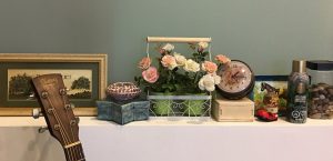
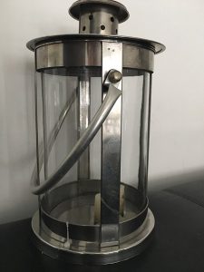
Now, why didn’t I think of using that for a painting? It was there ages ago and I did not ‘see’ it. I bought it out of sheer fun. It was a deco knick-knacks from one of those home furnishing outlet.
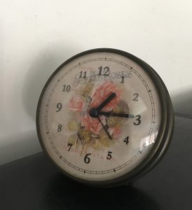
It has not been working properly even though I have tried changing the battery a zillion time. I believe that it has a mind of its own. Sometimes it starts to tick and just died as and when it feels like it. And I… will talk to it, when it decided to get ticking. I will say out loud like “Oh, look who’s back!” (Oh no worries, my husband knows I’m a bit loco, sometimes. He knows what he’s in for when he decided to marry me.)
Next, I need something to compliment this clock because I am not going to paint this subject on it’s own because it is not the real thing. I went hunting around the house and found this lamp from IKEA under the TV console, sitting there collecting dusts and I thought, perfect!
Now, how do I go about to make these two look interesting? Both of them look rather pale and boring. One is a fake antique, the other, a cheap metal/glass retro lamp. Play with the lightings, of course! That will trick the eyes. And so, the fun part begun.
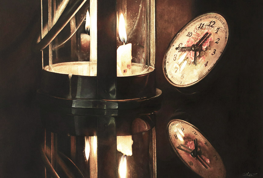
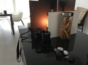
The set up was very simple. I lit up a used candle in the lamp an arranged the clock in an angle. Took out a few matt boards and blocked up the sides so that the glow from the candle will be contained. I used whatever prop I can find on the kitchen counter top, as you can see in the picture below. Nothing fancy.
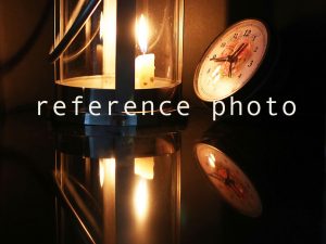
I took nearly 30 shots of the reference, in various angles. Putting into consideration the mood and the feel of the overall composition. Once I have selected a few potential photos, I transfer them to my computer to get a better view. Using basic Photoshop, I tweak the intensity of the colours and lightings and also look into the overall composition in various angles.
Instead of the using the whole subject as the main focus point. I cropped it in a way that the eyes will zero in directly to that one candle light. Composition is such that you want the eyes to go straight to that stand out subject and then gradually, the complimentary surroundings. You want the eyes to discover more as it move along.
Of course, the overall mood is paramount. What and how you want the viewer to feel when they see the painting. So in this piece, I want to portray the feeling of quietness. Not quite silence since the clock is supposedly to be ticking and the candle will be crackling. The hands of the clock showing the time after midnight presumably, since it is dark. The candle lights and the reflections were still and quite straight. That itself says ‘hush’.
By intensifying the yellow and orange tones, it brought out the warmness. If I were to lightened the tones to a more neutral colours, it will turned out either flat or very eerie. So, here is the end result of the reference photo.
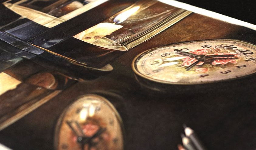
This piece was done on a 300gsm (140lbs) hot pressed, Arches aquarelle paper. I used both the Faber-Castell Polychromos and Caran D’Ache Pablos colour pencils.
As usual, with all my realism paintings, I used the basic grid line to enlarged it unto the paper. It also helped with the accuracy of the subjects, especially the numberings on the clock. I am never worried of not getting super accuracy because what I am doing here is realism art and not photorealism art. Instead, I paid utmost attention to the values and nuance.
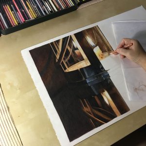
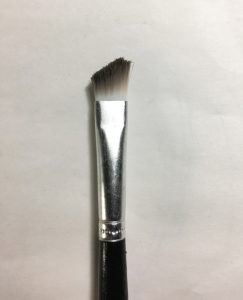
With this piece, I finally get to experiment with the bristle brush blending method. I knew about this method for quite a while from various colour pencil artists. I improvised the brush a bit as I do not want to spent a bomb on a good brush. What I did was get a cheap nylon stiff brush, the one that kids uses. I trimmed the tip short and at an angle, like the brow brush we women use for make-ups.
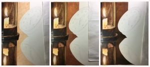
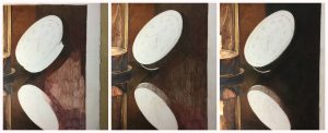
I built up all the colours/tones that I need on the paper. Making sure the tip of the pencil is very pointy to get into the groove/tooth of the paper, very light with the first layer. I kept going until I get the right shades. Lastly, using the brush to mix and push the pigment further onto the surface. Below is the short time-lapsed video on the method.
Overall, this piece turned out to be very interesting and a good learning curves because it was my first time working on multiple reflections. The clock was OK since I have done a few pieces on that particular subject.
Seeing this, I knew that there’s no limit of this medium. With right techniques, it is possible to produce art pieces that are at par with other ‘recognised’ medium. Only downside is that it is much slower and tedious but still, it intrigues me to no end. I shall keep on exploring art with colour pencils and I know as I go along, there is much more to discover.